
Serving Central Illinois since 2002.
Your usage graph at volo.net/usage displays your total network usage for the past 24 hours, as well as a 60-day history of your usage trends.
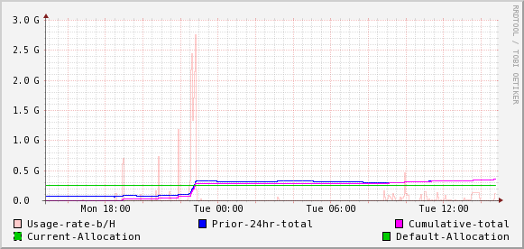
Example usage graph: 367M used of 250M allocated (speed limit 100Kbps)
The most important lines are the blue and green lines. The green line represents the total amount allocated to you in a sliding 24-hour window. The blue line represents your total usage over the past 24 hours. When your total usage exceeds your allocation, as in the example around 11pm Monday night in the example, your connection speed will be reduced.
The light pink line represents your usage rate. When that line has a peak, you were using up your allocation very quickly (downloading or uploading a lot of data), and you'll see the 24-hour-total line increase quickly as that happens.
The dark pink line reprents your cumulative total over the past 24 hour period. By definition, it will start at zero on the left (24 hours ago) and rise up to meet the blue line on the right (now) at the total amount used, which is 367MB in the above example.
A slowly but steadily increasing cumulative total is often an indication of a somewhat low-rate internet service, like streaming radio, running constantly. Such a service, left on throughout the day and night, can consume a significant chunk of your allocation.
Very large spikes in the usage rate line can indicate P2P software (like BitTorrent) being active.